Redesign proposal for a non-profit organization to make its digital presence more sophisticated and clear communication.
Background
Pure Earth is a non-profit organization focused on solving pollution and environmental challenges worldwide. This project was a redesign proposal aimed at improving the usability and overall experience of their website
PROCESS
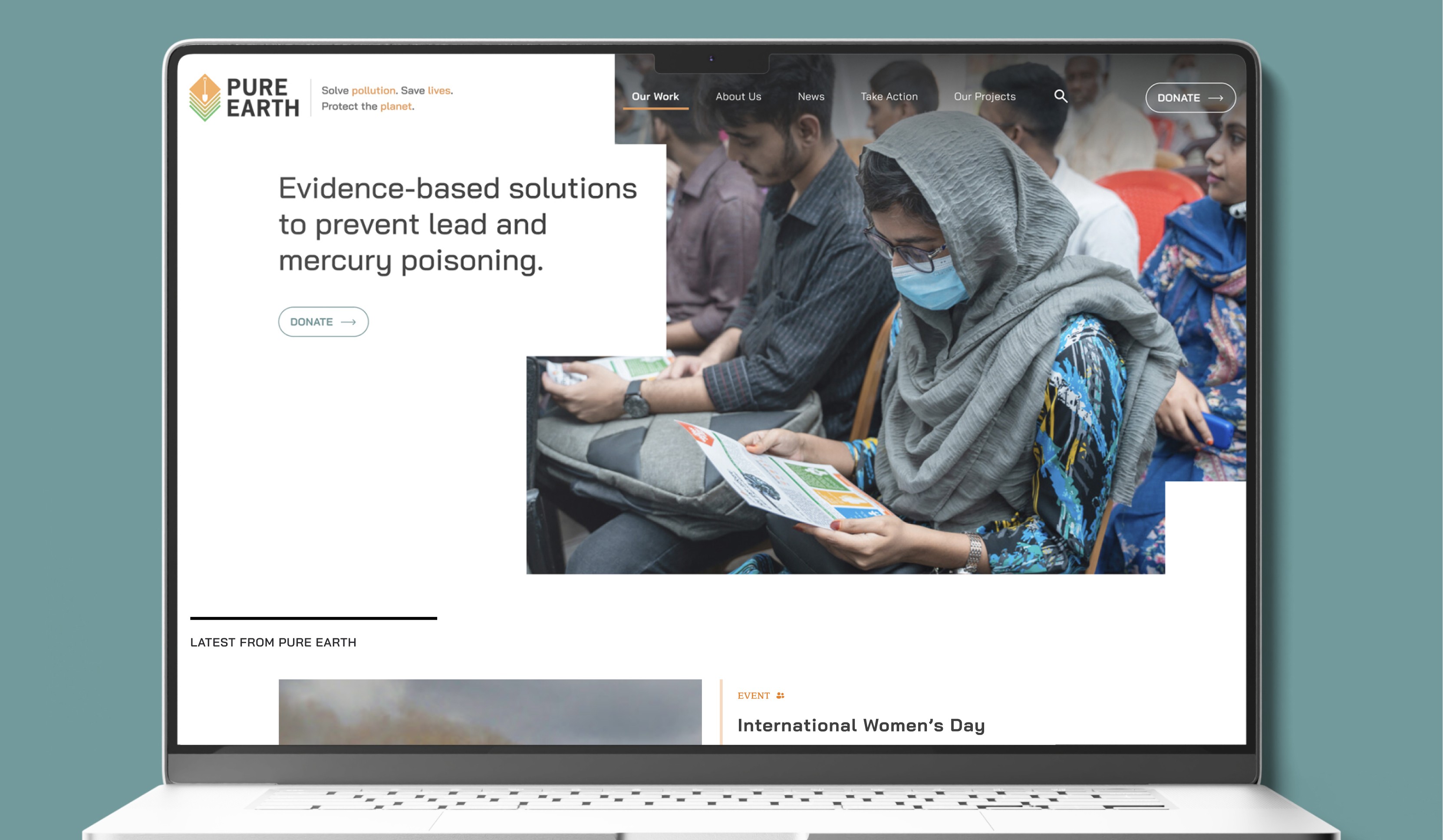
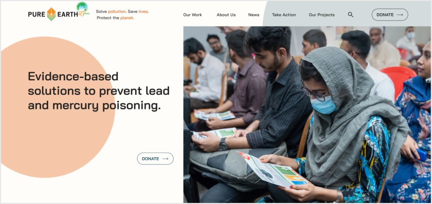
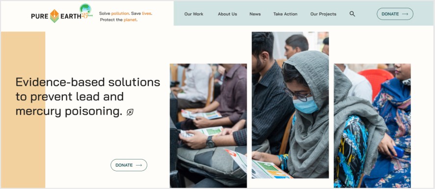
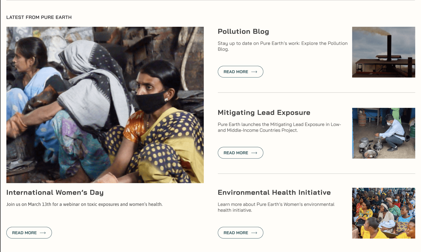
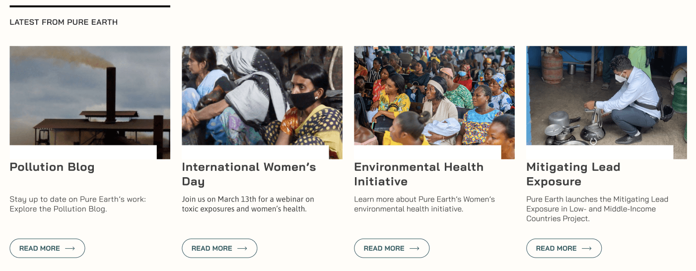
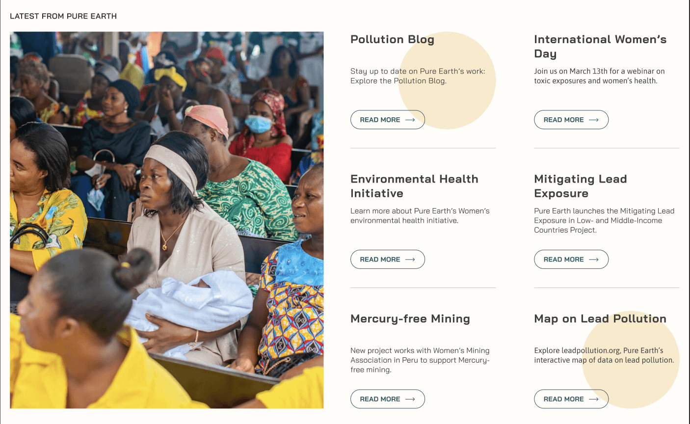
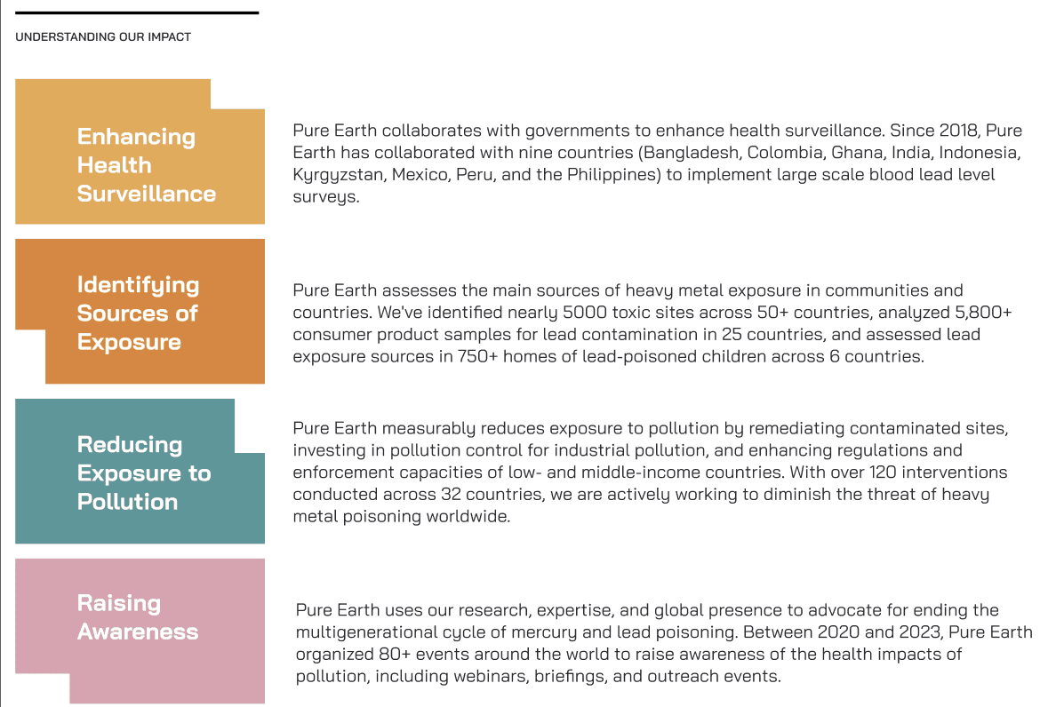
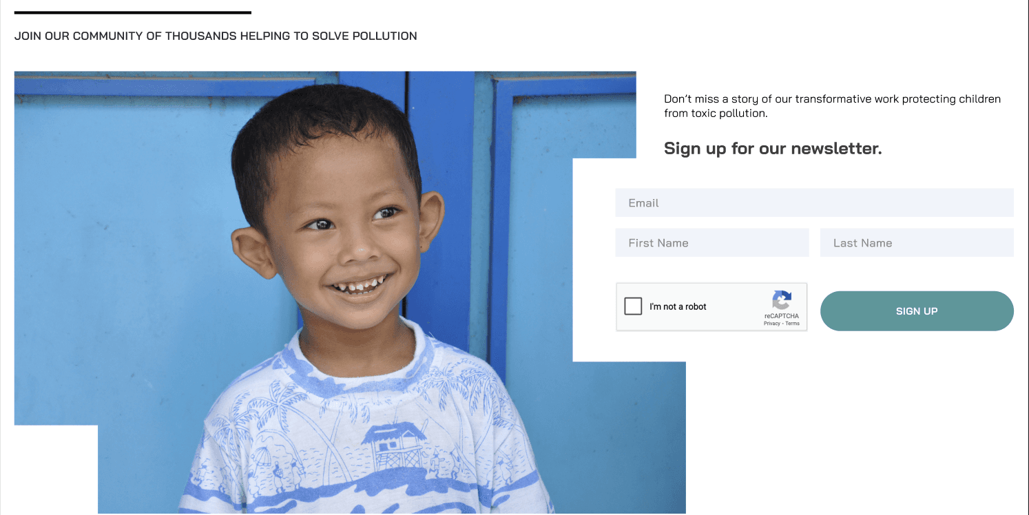
The redesign focused on creating a clearer, less overwhelming user experience by simplifying cards and content. Visually, I introduced a brighter and more joyful design system that highlights the organization’s positive impact.
OUTCOME
The redesigned concept presents a cleaner, more optimistic interface that improves usability while strengthening the organization’s message of hope and action. The new UX and UI direction creates a smoother, more inviting experience that better connects users with Pure Earth’s work.
ANALYSIS
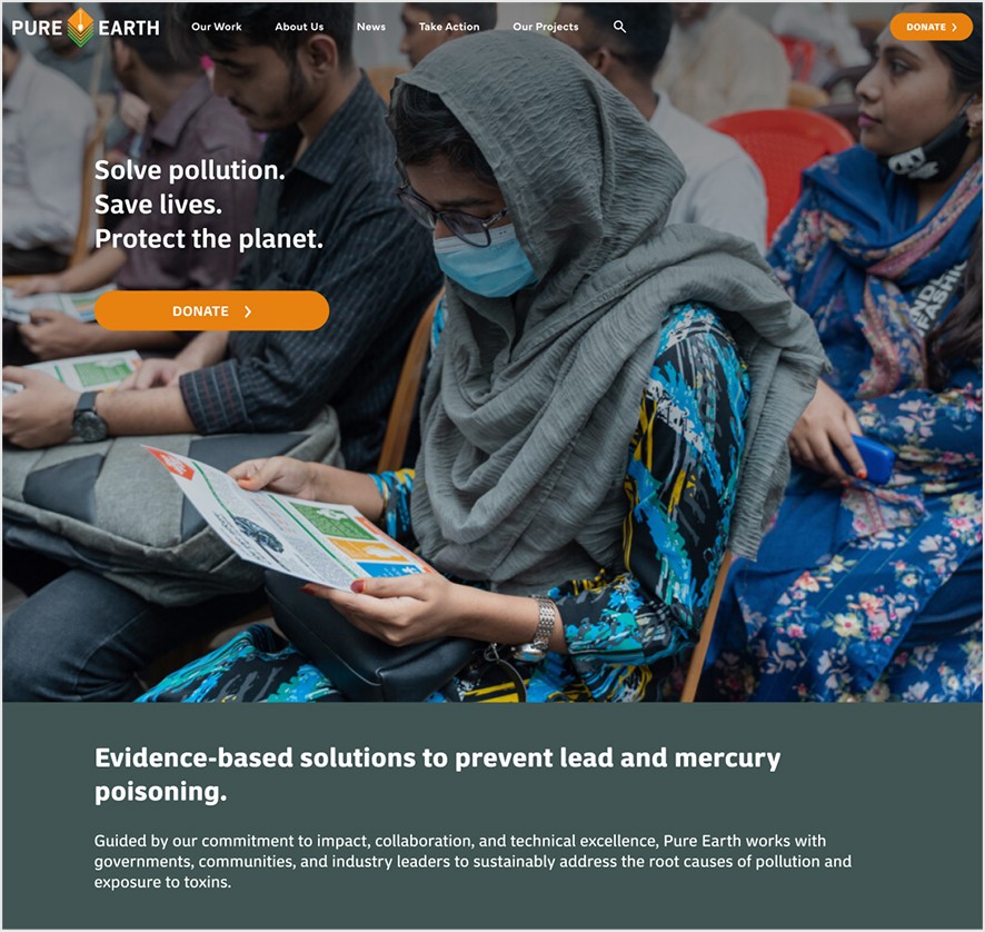
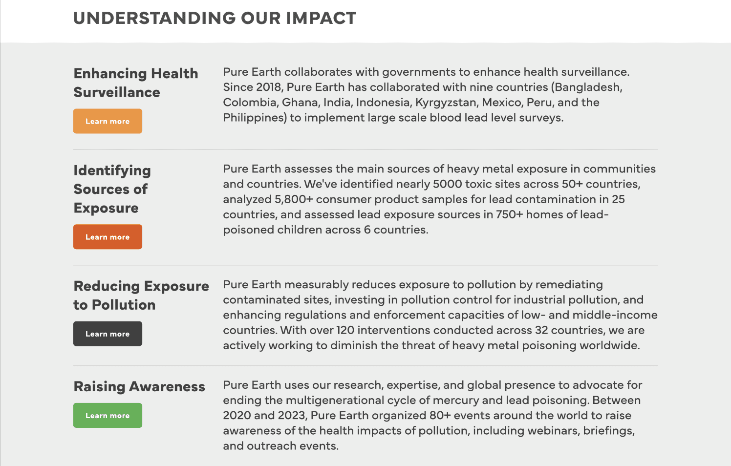
The process began with a detailed review of the existing Pure Earth website to identify usability issues, content hierarchy challenges, and opportunities for visual and structural improvement. Comparative research was conducted on other non-profit and environmental organization websites to understand effective methods for presenting complex information in an accessible and emotionally engaging way. Key insights from this phase guided decisions on layout, navigation, and tone.
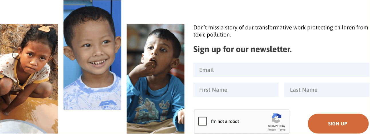
CURRENT WEBSITE
EXPLORATION
Based on the analysis, several layout and interface concepts were developed to enhance clarity and user flow. Visual proposals emphasized the use of clean typography, balanced white space, and a more natural color palette inspired by the organization’s environmental focus.
color exploration
LANDING PAGE EXPLORATION
Cards EXPLORATION
SQUARES EXPLORATION
BANNER exploration
The user interface was designed to reflect both professionalism and approachability. Components such as navigation menus, project cards, and impact sections were reimagined to improve readability and interaction. Visual hierarchy and consistent spacing were used to highlight key messages and calls to action, encouraging users to learn more, donate, or get involved. The redesign aimed to make the website not only more functional but also more emotionally resonant, aligning with the organization’s purpose-driven message.
LANDING PAGE
“OUR WORK” DETAIL PAGE
OUTCOME & LEARNINGS
The process emphasized how strategic design choices—such as consistent layouts, focused messaging, and cohesive branding—can strengthen trust and engagement with users. By refining navigation, content organization, and visual language, the redesign made the website more intuitive and visually coherent. It also provided valuable experience in aligning visual storytelling with organizational goals, translating mission and impact into a unified, compelling digital presence.
